
Preparation for Printing
The specifics of flexographic printing differ from the more popular offset printing technique. Flexographic printing, also known as roll printing, is characterized by a relatively fast rate of imprinting polymer matrices on long strips of material. This guarantees 100% color repeatability and ensures that all labels on the roll are identical. Receiving designs on a single strip also significantly facilitates the product labeling process itself.
To speed up the printing process, it’s worth taking a moment to properly prepare your file for printing. This will save you time and allow you to receive the final product faster. Remember that the turnaround time is calculated from the moment the graphic files are accepted, so well-prepared files will significantly speed up our work.
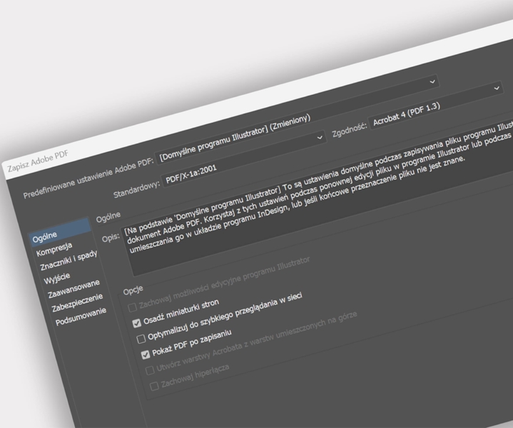
File Formats: .ai .pdf
The specifics of flexographic printing require us to intervene in the graphic file and modify its layers, for example, when correcting bleeds or masks. Therefore, we need an open file with preserved layers that we can easily navigate. The prepared file should be saved in an open format, such as:
.ai – Files prepared in Adobe Illustrator, version CC 2019 or later, with preserved layers and embedded images in the file.
.pdf – Files prepared in other programs. Saved in PDF format version 5.0 or higher with preserved layers and the ability to edit.
Digital Printing – Preparing files for digital printing is not as complicated and does not require as much attention as flexographic printing, however, to speed up the printing process, please also prepare files in .Ai or .PDF format.
Color – CMYK
Color is one of the most important issues in printing. We see most designs before printing only on a computer screen. Depending on the quality of the equipment you have, the design may look different on different monitors. The problem of transferring colors visible on the screen to paper stems from one fundamental difference – the screen is black, we illuminate its space by combining the primary colors of red (R), green (G), and blue (B). In this way, we obtain the desired color; the more light, the brighter the color. At the maximum moment, we will get pure white on the screen. However, it is the opposite in printing, where we start with a white sheet of paper, which we print with the primary colors Cyan (C), Magenta (M), Yellow (Y), and Black (K). The more ink, the darker the color.
All colors in CMYK
Remember to work in the CMYK color space. This will guarantee a much greater color reflection of what you see on the screen. It does not guarantee a full reflection of the screen, but it will certainly be closer to the truth than with RGB projects.
Digital printing – regardless of whether we print in digital or flexographic technology, in order for the printout to reflect the design from the computer screen, it must be prepared in CMYK colors.
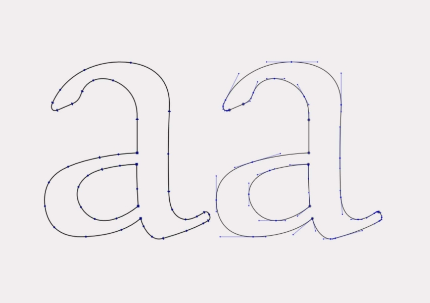
Fonts
Label designs contain a lot of descriptions and text. They are often written in different fonts, divided in a special way, maintaining appropriate distances and divisions between characters. Everything looks good when we work on our computer, opening the file in another place may cause the file to look completely different.
Convert fonts to curves
To avoid such a problem – convert all fonts to curves. Thanks to this, the written font will be saved as a geometric object that will be visible in the same way on other computers.
Text in one color
Using CMYK colors for small texts may cause the text to be illegible due to the shifting of superimposed color layers. To avoid this problem, the text should consist of one color.
Minimum line thickness
To ensure that texts and applied graphics are clear, do not use lines thinner than:
- 0.08 mm from one color
- 0.5 mm in a composite color
- 0.15 mm in reverse from one color
- 0.8 mm in reverse in a composite color
Digital printing – always convert fonts to curves, regardless of whether you are printing digitally or using flexographic technology. Digital printing technology allows us to print very thin lines and very small fonts, however, it is recommended that they are not smaller than 4 pt.
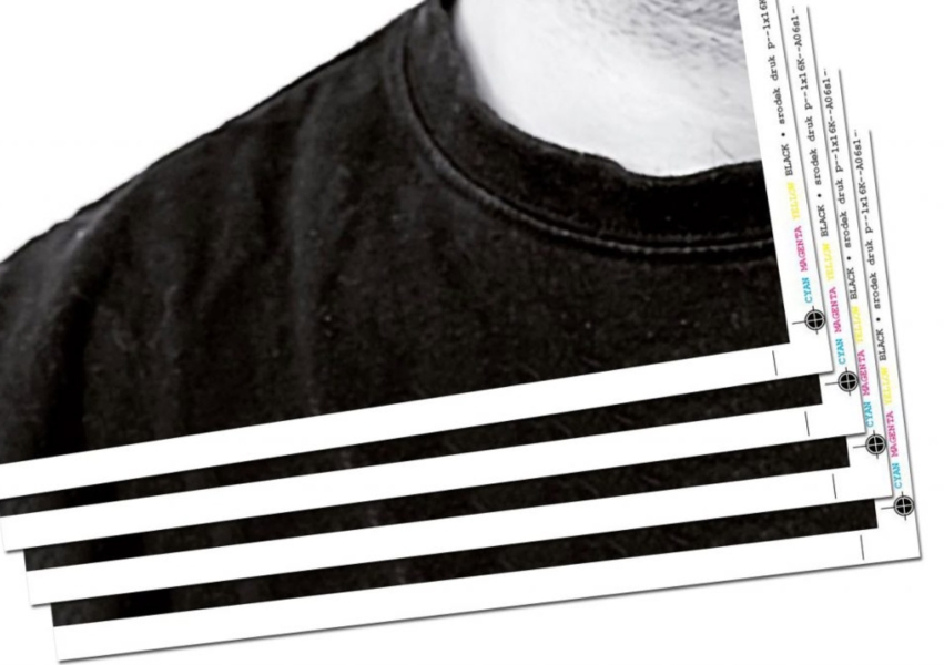
Bleeds
Minimum 2 mm on each side
Bleeds are the area of the design that will be cut off by the die cutter. However, there must be graphics in the place that will be cut so that even after a slight shift, the image still looks aesthetically pleasing and has printed graphics.
Digital printing – in this case, the technology does not matter, regardless of whether we print digitally or flexographically – bleeds are always required. When cutting labels, some of the print will always be cut off by the die cutter knives.
Die Cuts
Apply the die cut line to the design
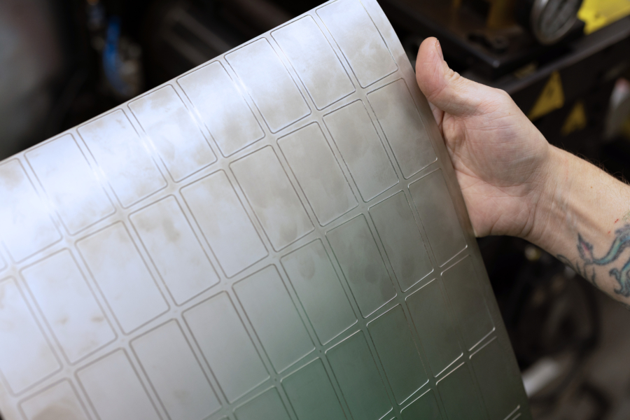
Label designs often have different shapes and dimensions. Thanks to technology, we are able to cut any shape in the material, but we need to know in what relation to the label it is located.
The die cut, regardless of its shape, must be centered on the work area.
If you want to apply the die cut to the graphics, you must use the additional color DIE CUT with the object attribute “darken”, preferably on a separate layer.
If your label has a non-standard shape, you must apply the die cut line to the graphics, taking into account the above conditions (centering, additional color, darken).
You do not need to apply the die cut if it is a standard die cut in the shapes: rectangle, square, circle, oval.
Digital printing – do not apply the die cut as graphics in the design for digital printing. Mark it as an additional color or mark it on a separate layer. Also remember to center the file in the work area.
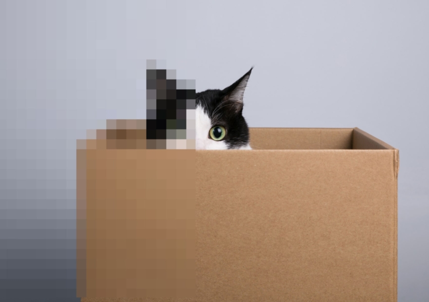
Image Resolution
Image resolution – 300 dpi
Resolution is nothing more than the density of printed color dots on the material. For the image to be clear and sharp, the dots must be densely printed. Designs prepared for printing should be saved in a resolution of at least 300 dpi. Otherwise, the printed image may be blurry and pixelated.
Digital printing – the resolution in printing should always be kept at 300 dpi.
Masks and Additional Color
When preparing files for printing, we often encounter so-called masks and additional color. We create them to mark places in the graphics that we want to additionally cover with varnish or another color of ink.
This is very important when we print on non-standard substrates of other colors, e.g. silver or transparent. The applied inks may ultimately look different than the design on the computer, so we use a white underprint, i.e. backing with white ink. We can apply such an underprint in its entirety, but more often we do it selectively to also show the qualities of the raw material itself. This is the case with silver Rainbow foils, where after a single printing we get an iridescent color, and in the place of the white underprint, a standard print.
How to properly prepare an additional color mask
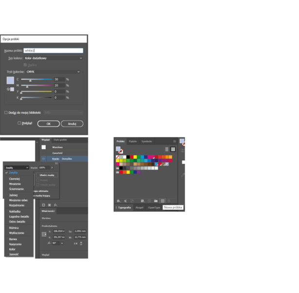
- Set “additional color” in the program. Name it white1.
Illustrator
Window > Swatches > New Swatch > enter the name white1 > Change Color Type to Spot Color > enter CMYK values
Looking for the perfect labels for your product?
Contact the sales department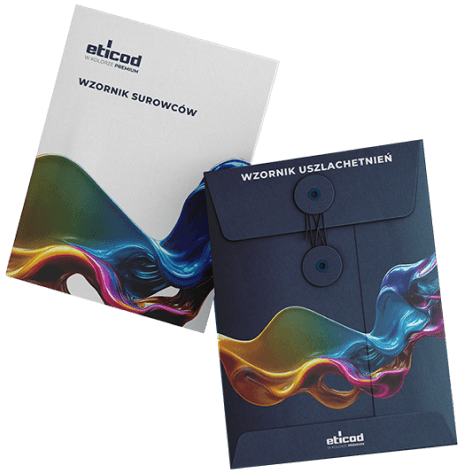
Refinement template
We have in our base more than 130 raw materials on which we print. We are also ready to respond to your needs and print on raw materials that will meet your requirements. Contact our specialists in the sales department to receive a sampler with label designs prepared to meet your needs.
online template